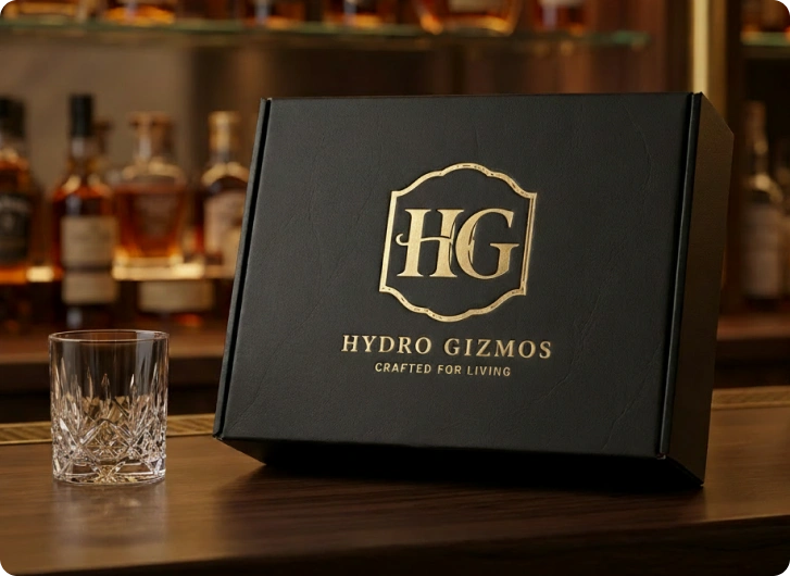
How Tabula transformed Hydro Gizmos into a premium digital experience built to showcase the product, simplify the journey, and convert attention into action.
A better product deserved a better digital experience.
Hydro Gizmos creates distinctive whiskey decanters designed to turn an everyday pour into a statement piece.
The challenge wasn’t simply to make the website look better.
It was to create a digital experience that made the products feel as considered, premium, and distinctive online as they are in the real world.
CLIENT
Hydro Gizmos
INDUSTRY
Luxury Barware
E-commerce
SCOPE
Strategy · UX/UI
Web Development
FOCUS
Conversion
Product Storytelling
Mobile Experience
PLATFORM
Shoppify
APPROACH
Strategy → Design → Development
THE CHALLENGE
The product had the personality. The website didn’t.
Hydro Gizmos had a strong product proposition, but the existing digital experience created friction between discovering the brand and understanding why the products were worth buying.
The experience felt fragmented, the hierarchy wasn’t doing enough work, and the products weren’t receiving the visual attention they deserved.
The opportunity wasn’t another redesign.
It was to build a digital experience where every interaction worked harder
A Weak First Impression
The website wasn’t immediately communicating the premium nature of the brand or its products.
Too Much Friction
The journey from discovering a product to understanding it and taking action wasn’t as clear or intuitive as it needed to be.
Products Lacked the Spotlight
The visual experience didn’t give each product the space, context, and storytelling needed to create desire.
Inconsistent Experience
Navigation, layouts, content hierarchy, and interactions needed a more unified system across the experience.
THE TABULA APPROACH
We didn’t start with pixels. We started with the problem.
Tabula approached the project as a complete digital experience, rather than a collection of individual pages.
We looked at the brand, the customer journey, the information architecture, the product story, the conversion path, and the visual system, then connected them into one experience.
AUDIT
We identified the UX, visual, content, and conversion issues holding the existing experience back.
STRUCTURE
We reorganized the information architecture and navigation around how customers actually explore and evaluate the products.
EXPERIENCE
We created a clearer path from discovery to consideration to purchase.
DESIGN
We introduced a premium visual language designed to make the products feel desirable, distinctive, and credible.
BUILD
We translated the system into a responsive, production-ready website designed for consistency across desktop and mobile.
THE TRANSFORMATION
Same products. Completely different experience.
The redesign wasn’t about adding more. It was about removing the noise and giving the right things more attention.
A clearer hierarchy. Stronger imagery. More intentional spacing. Better product storytelling. And a simpler path to purchase.
More Impact
A stronger first impression that reflects product quality.
Clearer Journey
Easier navigation and product discovery.
Built for Growth
A scalable foundation for future opportunities.
Stronger Engagement
More space for the brand and products to communicate.
WHAT CHANGED
Every part of the experience was given a job.
We rethought the website from top to bottom, and every element was designed with a purpose.
CLEARER
NAVIGATION
Simplified structure helps users discover products, collections, and key information with less effort.
STRONGER
STORYTELLING
Product pages communicate the experience, craftsmanship, and value behind each product — not just its specifications.
PREMIUM VISUAL DIRECTION
Cinematic imagery, refined typography, intentional spacing, and stronger composition create a more elevated brand experience.
CONVERSION-
FOCUSED UX
Product information, calls to action, and purchasing moments were structured to reduce hesitation and make decisions easier.
MOBILE-FIRST
THINKING
The experience was designed responsively from the beginning, ensuring the same clarity across desktop and mobile.
ONE CONSISTENT
SYSTEM
A unified component and visual system keeps the experience cohesive across pages while creating a stronger foundation for future growth.
home page
product page
mobile experience
THE RESULTS
A stronger brand. A brighter future.
The new website didn’t just look better, it created a more meaningful connection between the brand its customers.
By combining strategic thinking with intentional design, we helped Hydro Gizmos build a digital experience that works harder, looks sharper, and is ready for what’s next.
Clearer navigation and a more intuitive purchase journey.
Greater Product Engagement
Product are now presented with the attention they deserve.
A Scalable Foundation
A flexible system ready to support future growth.
+148%
Add-to-cart rate vs old site
5 / 5
Customer satisfaction post-launch
8 weeks
Full design-to-handoff timeline
THE IMPACT
Results after Launch
Measured across 60 days post-launch. Data sourced from Shopify Analytics, Google Analytics 4, and Hotjar session recordings.
Add-to-Cart Rate
+148%
The redesigned product pages, with editorial storytelling and clear gift-occasion framing, more than doubled add-to-cart events across all three collections.
2.1% to 5.2% ATC rate
Session Duration
3.2×
Users spent over 3× longer exploring the new site. A clear signal that the improved navigation and storytelling created genuine engagement with the collections.
1m 12s to 3m 52s avg.
Homepage Bounce Rate
-54%
Bounce rate dropped from 54% to 24% on the homepage. The clearest possible signal that the navigation rebuild resolved the core confusion identified in the audit.
54% → 24% bounce rate
UX Satisfaction Score
5/5
Post-launch results surpassed the expectations of the client. The new redesign was able to successfully lift the brand from average to premium.